Wednesday, May 30, 2012

Advertising Algorithm FAIL

Today was perhaps the worst of a series of bad days in Seattle. Gun violence here has been incredible.

A man suspected of shooting five people at a University District cafe — and a woman later on First Hill — shot himself as police closed in.

Turns out today's maniac — mentally ill of course, god forbid we hospitalize these folks — once lived next door to my son Nick, who called me this afternoon to mention that the SWAT team was in his back yard and cops were busting into the neighbors' place. (One of the shootings took place in a coffee shop down the street which Nick frequents.)

What has this to do with UI text, you might ask?

Well, see, I spent a fair amount of time on Facebook today monitoring the situation and chatting back and forth with friends, family, and Nick.

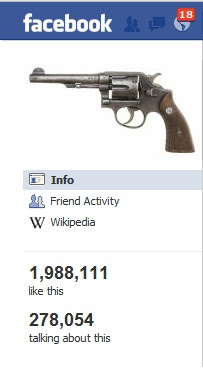
And here, several hours after the fact, FB blithely displays for me a bunch of Recommended Pages in the sidebar, including "Books" (3 of my friends like) and "Shooting" (1,668,817 people like).

Aside from that nauseating statistic, why the frack does Facebook want to recommend THAT to ME, TODAY of all days?

Oh, and when I delete that one, I get "Guns" (1,987,504 likes). I guess I should be grateful that there are 318,687 weirdos on Facebook who just like guns but not shooting them.

And my point is?

I figure it has to be that FB is monitoring my posts, or the posts I recently commented on, and finding the common denominator. Which in the case of chatting about movies or music or cars or Twinkies or whatever would be insidious enough, but where their algorithm FAILS is not deducing that I'm posting about guns and shooting not because I like them but because I think they're an abomination.

Monday, May 28, 2012

Icons That No Longer Make Sense

Must be a sign of harmonic resonance or something. I was just talking about this sort of thing with my 14-year-old daughter (and she was the one who brought it up!) the other day.
Icons That Don't make Sense Anymore

By the way, Blogger, since when do I use a pencil to create a new blog post?

Thursday, May 03, 2012

The perils of appearing accurate

At work the other day, we were looking at a prototype of some software. The concern arose that, when we unveiled the prototype to the PTB (Powers That Be), they might get the wrong impression: if it looked too finished, they would take the demo UI too literally. At the very least the PTB could begin unnecessarily nitpicking... "rat-holing," in the common parlance.

Oddly, this misapprehension can occur with released products too. They look so darn good, so authoritative. In fact, most products out there will have some flaws, but the trick is to not let the consumer see them. Naturally this requires a bit of smoke and a couple of mirrors.

But the example of deceptive accuracy that sprang to mind as I was looking at our prototype was a set of IKEA assembly instructions. Now, by and large these are pretty decent, not least because they use little or no language, just illustrations, hence you get none of the infamous "Engrish". But the illustrations look very convincing. The number of screws is listed, there are helpful dotted lines showing where they go, and so on. They are of course too small to be really super-clear, but they do look pretty dang painstaking.

The key syllable, though, is "pain." Seldom have I assembled an IKEA item without at some point having to undo some or all of my work and attack it again — not necessarily because of human error (mine) but because some vital morsel of information has been left out, or is unclear. A screw may not have been drawn correctly. The number of screw holes drawn may not match the number of screws in my packet. In short, the seeming accuracy, the spiffy “fit and finish” product feature (in this case the manual rather than the object to be built) fools me into trusting it.

Now, there’s always the chance that I’m simply so anal that I fixate on the “perfection” or lack thereof, rather than just using my common sense and building the darn bookcase using the Occam’s Razor approach. But perhaps in some cases it is better to be vaguer in the implementation: "describing rather than prescribing" might be a way to think about it.

Saturday, April 14, 2012

The Pleasure of a Simple Early Morning Interface

Here's an example of UI text and design that warms my cockles. This is an automatic coffee-maker in the lobby of the Mark Spencer Hotel in Portland, Oregon.


All in all, especially given the initially intimidating array of controls, it is actually pretty easy to get what you came for: a cuppa joe "grilled to your order."

Granted, the interface is biased toward left-to-right readers, but your eye may be drawn first to the bright blue LCD screen at the upper right, which prompts you to "select drink." This box acts as status text, changing as you make your selections.

There is helpful, concise, instructional text, in a different color from the options (for the non-colorblind), with nice big numbers.


Group boxes contain your drink options. Minor point, I don't think the select/scroll arrows are necessary design-wise, you ought to be able to get the job done just by pressing the desired choice (especially when you just have two choices, such as hot versus cold drink). Also they probably could have reduced the number of lines around the boxes.

The "OK button" is large, clear ("Start") and color-coded green for Go.

The one thing I'd pick at is the pair of buttons (Clean and Program) above the Start and Cancel buttons. Very few people should use these, and I think a better placement would be under Start/Cancel just to clarify that they're not in the standard order of navigation.

Wednesday, April 04, 2012

The Embarrassment of Insufficient UI Text


I discovered the following user-interface at my local Jewish deli.  Each booth has a little Windows touch screen, from which you can perform various tasks while awaiting your meal, including viewing their menu and, for those with no inner resources, as John Berryman would say, playing video games.  

One of the games offered seemed just too intriguing (especially in the context of a family restaurant!) to resist: it was called “Dress the Waitress.”

To begin with, the screen did not respond very well to my taps and presses.  But more importantly, the UI text (or lack thereof) deserves our attention.

Upon my tapping the “Dress the Waitress” menu icon, a picture of a waitress appeared, shown wearing a standard black “waitress” outfit, and carrying a tray of cocktails in each hand.

Strangely, the title of the game now appeared as “Dress the Doll.” Anyway, large magenta buttons on the right side of the screen let me know I could change such attributes as her skin color, eyes, hair, blouse, skirt, stockings, and shoes.

I tapped “Blouse”: accordingly, a sort of dialog box opened on the left side of the screen, displaying a variety of tops.  Assuming since it was a touch screen that I should tap an item to select it, I tapped a modest blue top. 

Instantly the pigeon-toed waitress's was stripped down to her red underwear. 

Hmm. I tapped the blouse again, to no avail.  I double tapped.  I tapped some other blouses.  I tried dragging a blouse into the figure.  Nothing.

I tapped Cancel – at least THAT worked! – and then tried putting stockings, and then trousers on her ... again, neither tapping nor dragging achieved anything.  So I knew that it wasn’t just a glitch in the Blouses dialog box.

But, I thought, was I doing something wrong? Was the touch screen broken? Was the game broken? Was my finger insufficiently electrostatic?  I had tried tapping with several fingers, with both tips and pads... nothing restored her outfit. 

There were no instructions on the screen, no error messages or prompts. 

What seemed by all appearances to be a fairly clear interaction (assuming the user has used a touch screen before) not only produced an unexpected and undesired result, but refused to be further amended except by cancelling altogether.

FAIL.

Please forgive the dreadful photo, I had only my cellphone camera at hand. 


Thursday, March 08, 2012

Facelift

For what it's worth, I not only applied a new template to the site but cleaned out the list of UX links and added few new ones, including a link to my new editing/writing consultancy, No Nonsense.

Wednesday, March 07, 2012

Marketers vs. My Mother

I trust I am not alone in noticing, and detesting, the preponderance of advertising that has, in the last few years, begun to appear in all sorts of places one might not expect it, much less desire it.

Billboards that cover up bus windows... Big ol' text-based ads that have replaced the once pictorial bottom half of the newspaper TV section... The front page of the newspaper replaced with a full-page ad! An ad plastered on the cover of the phone book, for crying out loud...

And on envelopes. I mean, on envelopes that contain something other than more advertising. Like bills. Take Comcast, for example (which has, for some inexplicable reason, exchanged for another "word" that doesn't even make sense, Xfinity, but I'll let that go for now).

My elderly mother recently discovered (with my sleuthing) that her Comcast cable TV was shut off because she (that is, I) hadn't paid her bill in three months. My theory: the envelope was so covered in unnecessary advertising that it no longer looked like a bill — it looked like, well, an ad! And thus it got recycled.

I mean, she already subscribes to cable, why should she need to see more ads? Oh, I know, it's Capitalism at its best. But she got whacked with suspension of service AND a late fee because of, essentially, the bad design of the envelope. Oh, and Comcast's well known greed.

Bentley's Rule of Singularity of Purpose: If you want the user to complete Task A, don't throw them off track by a big gaudy 'Task B' label (e.g., the ad) that has nothing to do with the real controls (e.g., the bill payment stub). There are places where advertising simply is not necessary, much less appropriate.

This kind of bait and switch happens constantly on web sites, where you click one thing, thinking it's another, simply because it's big and bright and flashing at you. Or, more to the point, you don't click what you ought to click, because it looks like — or is totally overshadowed by — spam.

Do we really, really, have to be bombarded with marketing during every miniscule action, every place we happen to cast our eyes? Does anyone — and I even mean the companies these ads represent! — really, really benefit from constant advertising? There needs to be some downtime for the user, some time to reflect, to — let's go out on a limb here — to use our minds!

I stopped watching TV several years ago because the advertising was simply unbearable. Maybe I'm just neurotically sensitive, but I like to immerse myself in what I'm doing, whether it's reading, watching a film, talking to someone... I don't want to be interrupted every 30 seconds. My kids are grown up and I don't have to endure that any more, thanks very much, I paid my dues!

And for those folks who have a hard time figuring out reality in the first place, such as my mom, can we just give them a break and stop polluting the message? A bill should be a bill. An ad should be an ad.

One place not to present a swanky existential conundrum

In other news, I just had lunch at a relatively new restaurant in town. While the décor is more glam-hotel than hipster, it has definitely seen the efforts of a determined designer striving for, I don’t know what – friendly chic? At any rate, my UX radar bleeped loudly only at the point when I attempted to find the restroom.

Painted vertically on the wall in "cool" but unnecessarily industrial lowercase font were the necessary ‘men’ and ‘women’ — but there were no doors! Beside the ‘men’ was an alcove that looked as if a door ought to be there, but there was only a padded leatherette, nearly floor-to-ceiling, rhomboidal panel. Didn't look like a door, but I gave the wall a light shove just in case and, not surprisingly, nothing happened. I moved on down the hall, thinking perhaps... but no, here was ‘women’ with a similar situation. No handles, no further signage, nothing that actually looked like a door. At this point another male customer came along and blithely pushed open the ‘men’ wall and entered. Aha. I had not pushed the correct side of the wall.

I wondered why they’d designed the restooms as if they were meant to hide Anne Frank.

Forgive me, but it seems to me that a restroom is one of those items that above all else ought to be totally accessible and user-friendly. I have ranted previously on this blog (otherwise I would again here, since I ran into the same problem today) about “automatic” fixtures that don’t work as expected and have no instructions. But all that is moot if the person-taken-short in question can’t even figure out where the restroom is, or how to enter it.

Bentley's Principle of Control Visibility: Labels (‘men’) are good, but controls (a doorknob or even an indication of where to push — or pull!) are pretty dang necessary and should not be hidden or designed right out of usability.

There are a number of perfectly good more or less traditional ways of signifying a restroom. A place to pee ought not to present a swanky existential conundrum.

Friday, March 02, 2012

Customer Rightness Dept.

Ahem. Well, it has, again, been unconscionably long since my last post. A case of feast/famine, either I was too busy to have time for blogging or, as of late, not busy at all, hence having little in the way of au courant topics to put down. The latter situation is because I left my job as user-experience writer at Microsoft. A fascinating story in itself no doubt but of little pertinence to UI text in particular.

Anyway, I have now gotten the ball rolling as a “consultant,” that dreaded and vague term known to all refugees from the world of corporate enslavement. And now at last I seem to have attained that optimum state where I have just barely enough work to provide me with blogfodder – there’s a neologism for ye – (although let’s not talk about “income” shall we?) and still plenty of time on my hands (metaphorically red-ink-smeared as they may be) to actually “reify it” “in print,” if I may use those hoity-toity terms.

My first foray into gun-for-hire “content consulting” (also don’t get me started on the notion of “content”) has dosed me with water perhaps not icy, but enough to cool my usually hot user-experience jets. I was asked to write – well, create, shall we say – web content for a local budding entrepreneur. Oh boy, I thought – UI text, my meat and taters!

Now, I’m pretty generous in my definition of what UI text is. In this case, the “web page content” was not articles, but more or less marketing hype (bane of my existence). But at least there wasn’t much of it. It was in fact brief enough that it served essentially as explanatory or informational text, much the way a block of text in a dialog box or splash screen might detail the purpose and functionality of an app, or what to expect from a set of options. In this case the site users were similarly being told what this company was going to do for them, what expectations to have when calling the number.

My client said the three pages needed to be based closely on the pages of a competitor’s site, so there was just as much if not more editing than writing involved. When I looked at the other site, it was plain to see a couple of things: first off, English was not the first language of that site’s writer, and second, he or she had had certain ideas about how to use SEO. Basically their plan was, the more you use a key phrase, the better, in terms of getting your page viewed by the maximum number of punters.

I’ll say right now that I’m no SEO expert. (I’m assuming there a still a few people on the planet who don’t know that stands for “search engine optimization.”) But a quick Google informed me that the old notion of stuffing your website with keywords was not effective. The latest search algorithms are more sophisticated. So I plunged ahead following my better instincts, trimmed out the triple redundancies, improved the grammar and spelling, and rewrote to avoid plagiarism.

I wound up with three concise, friendly, informative pages. The trifecta of UI text, as far as I’m concerned. What I’ve been trained for ten years to regard as the Holy Grail of User Experience. While proudly showing my client my draft I also pointed out the well known truth that people simply do not read big blocks of web text. No one visiting his site would have to unnecessarily wade through long gray paragraphs, reading and rereading ungainly, empty phrases in an attempt to weed out some crumbs of actual information.

Unfortunately my client was sad.

He liked the other company’s site. He protested that its text was fine: it was a very successful company, so obviously the text was fine. And obviously their repetitive SEO technique in particular was fine, because, presto, those sites popped to the top of his Google searches! (I wondered if the fact that he had repeatedly looked at those sites before contributed to their prominence now, and whether someone searching for the same terms cold would get the same results. SEO experts, feel free to chime in.)

My client was not a native English speaker himself, so while acquiescing to the idea of good spelling and grammar, he had no compunction about downplaying the niceties information design, let alone good literary style.

It was a classic case of “the customer is always right.” So I gave him what he wanted, reinserted the redundant phrases, put the duplicate boldfaced headings back in. I still reworded wherever I could so at least any reader who happens to have common sense and an ear for our language won’t be totally turned off by what might otherwise seem to be a hack job.

I’m reminded of my query some while ago – to what extent the quality of a site (in terms of language) does or does not reflect the quality of their work to a viewer. Not everyone knows English or cares. Depends on the business I suppose. I’m also reminded of a joke my father used to tell about contextual grammar. If you’re being chased by a bear and come upon your friend’s cabin, you beat on the door – when your friend calls “Who’s there?” you’ll probably yell “It’s me, it’s me!” rather than “It is I, it is I!” And that’s OK, as long as he opens the door.